Well, it’s done. Time for a long vacation with chaise lounges and drinks with umbrellas.
SL7Expo now has its logo.
![]()
In my life, I’ve been through at least eight logo designs for various ventures. Every time, I’m reminded: logo design and organization name selection is hard work.
First, a new venture needs a name. The name should reflect the venture, but it can’t interfere with other concepts, can’t be confused with other organizations, and—most importantly—must be unique.
It also has to be recognizable. I remember when someone once referred to Beaver College, and I couldn’t find it. It had been renamed Arcadia University. Why? Because once the internet came along, “beaver” searches often landed on porn sites. That’s a branding disaster. Lesson learned: never, ever pick a corporate name that can carry an alternative meaning.
SL7Expo started as a placeholder name in early discussions. But when we checked it online, it turned out to be completely unique. No negative or unintended associations. Searches brought back useful results, so we stuck with it. Short, distinct, and the .org domain was available. It doesn’t exactly roll off the tongue, but you can slur it into “slevenexpo,” which isn’t too bad. And once people realize it refers to SL7 ships, it makes sense and becomes easy to remember.
Now, contrast that with MAN Energy Solutions, which recently rebranded as—(I had to look it up again)—Everllence.
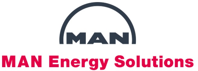
The company says the new name reflects their focus on sustainable, low-emission technologies and decarbonization. Supposedly it combines “ever” and “excellence,” drawing on a 250-year history of innovation.
Sorry, but that makes no sense. If you drop “MAN,” you drop the 250 years of history that gave the name meaning in the first place. And “ever” plus “excellence”? That could just as easily have been Sustainellence, or Susellence, or some other nonsense mash-up.
Still, I’ll give them this: “Everllence” is unique. That means domain registration is clean, and search results won’t drown in noise the way “MAN” inevitably does. That may have been the real driver. Companies often do that—tweak the name and adjust the logo to maintain recognition. Except MAN didn’t.
Their original logo wasn’t perfect—the script beneath was unbalanced, and it redundantly said “MAN” twice. But the logo itself? Strong, simple, one of the world’s best.
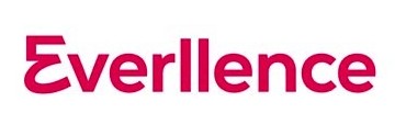
The Everllence logo makes no reference to that heritage. Instead, it’s just the name in a modern font, with a strange leading “E” that looks like either a crooked five or a backward three. Apparently, they’re also using just that “E” as the logo. What does it mean? No clue.
Would I really start calling MAN engines “Everllence engines”? Hard to imagine. Rebranding this sloppy and unimaginative makes me wonder: if the logo is careless, what does that say about the product?
Meanwhile, after the exhausting SL7Expo logo process, let me share a few thoughts.
No logo will ever make everyone happy. Logo design isn’t science; it’s emotion. Too many cooks, and you end up with sausage (or a camel). The only way through is to bring in a professional—in our case, Peter Mazurczyk of Fusion Creative—assemble a small steering committee, test with a larger audience, and then let the designer and committee finalize it without more interference.
Logos are subtle. Especially in the maritime world, they cannot feature clumsy or silly-looking ships. Our logo feels like an SL7 (or rather a T-AKR), but it’s not literally one. Dozens of small tweaks made it work.
Look at the bow: it drifts just slightly below the horizontal line—whether you see that line as a berth or a horizon— the vessel now feels like it’s moving. We tested bow waves, but they looked fake and old-fashioned. The ship instead has “lines of force” that center the design and create a high point.
Then there’s spacing. The white space between the 7 and the ship, and the E and the ship, had to be exactly right. That’s harder than it looks.
The font took real work. Once chosen, the 7 looked wrong, so Peter re-proportioned it. Fonts for maritime organizations have another constraint: they can’t be too directional. Put the name on a flag or a ship stack, and one side of the stack shouldn’t point forward while the other points backward. Our logo solves that—the ship itself can flip, and the short name can even be read inversely if needed.
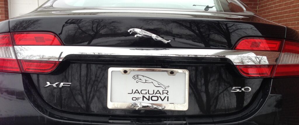
And sometimes, placement ruins everything. The beautiful Jaguar logo may look fine on the side of a car and great on the hood, but it looks terrible on the trunk. Once you see it, you can’t unsee it.
The Ford Mustang logo, oddly, does not suffer that fate. It relates to its excellent lines of force that are balanced left to right.
![]()
Logo design: it’s weird stuff. Almost as hard as ship design.